
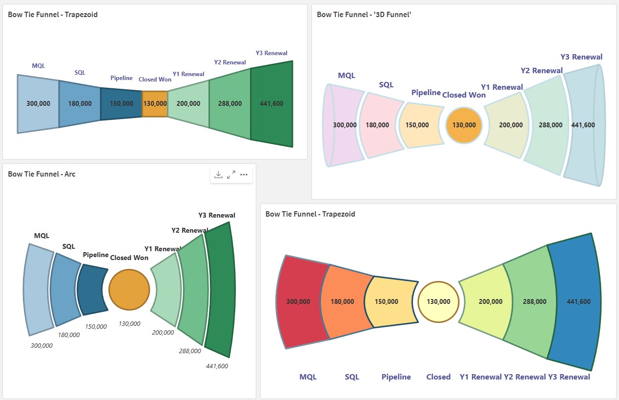
The Bow Tie Funnel takes the standard sales funnel — MQL, SQL, Pipeline, Closed Won — and mirrors it on the other side of Closed Won; the funnel widens back out through Y1, Y2 and Y3 Renewals, since a healthy renewal book with expansion and the cumulative Lifetime Value should increase substantially over time. Drawn well, it puts your whole revenue motion — acquisition and retention — on one axis, anchored at the moment a prospect becomes a customer.
It's a genuinely useful mental model for a leadership team. It's also one of the harder charts to build honestly, because the two halves usually aren't measuring the same thing.
Why it's conceptually powerful
Most GTM reporting treats acquisition and retention as separate stories, told in separate systems by separate teams — Sales owns the funnel into Closed Won, Customer Success owns what happens after. The Bow Tie Funnel forces them onto one chart. It makes two things visible at a glance that are usually buried in separate decks: how efficiently pipeline converts to new business, and whether the renewal & expansion motion is actually compounding that revenue over Y1–Y3, or quietly leaking it away.
For a board or leadership audience, that's a genuinely different conversation than "here's our win rate" and "here's our churn rate" as two disconnected numbers.
Why it's hard to implement well
The difficulty isn't the chart — it's that the pre-sales and post-sales halves rarely measure the same thing, in the same unit, from the same system, on the same timeline. A few of the mismatches that catch people out:
- Different units. MQL/SQL/Pipeline are usually counts or opportunity value in the CRM. Renewal stages are typically ARR — a different measure entirely. Plot both as raw segment sizes and you're comparing volume to value.
- Different systems of record. Pipeline lives in the CRM; renewals and expansion often live in a CS platform, a billing system, or a finance spreadsheet with its own definition of "renewed."
- Different owners, different incentives. Sales is measured on new logos and bookings. Success/Renewals is measured on retention and NRR. Each side tends to define its own stage in the way that flatters its own number.
- Cohort vs. point-in-time. A clean bow tie needs Y1 Renewal to genuinely trace back to the cohort of deals closed the corresponding period earlier — not this quarter's total renewal bookings dropped next to last quarter's new logos.
- What counts as "closed." Contraction, downgrades, and partial renewals rarely fit neatly into a single widening segment — without a clear rule, the right-hand side quietly becomes gross renewal bookings rather than net retained revenue.
None of this means the chart is misleading by nature — it means it's only as honest as the data model underneath it, and that model takes real work to get right.
Making it work
- Pick one unit for the whole funnel. ARR is usually the right choice on both sides — pipeline value in, retained/expanded ARR out — so segment width means the same thing left and right of Closed Won.
- Build it on a Single Source of Truth, not two exports stitched together. Pipeline and renewals need to sit in one governed model with agreed definitions, not a CRM chart and a CS chart glued side by side. See Single Source of Truth for how I'd approach that.
- Cohort it properly. Anchor Y1/Y2/Y3 Renewal to the actual cohort of business closed that far back, not to whatever renewed this period. Otherwise you're comparing unrelated populations.
- Agree what "renewed" means before you build the chart. Gross or net of contraction? Does expansion count separately or blend into the renewal segment? Get Sales, Success and Finance to sign off on the definition — the same discipline that fixes Sales and Marketing alignment on SQL definitions applies here.
- Get organisational buy-in on the story, not just the chart. The bow tie only earns its place on a leadership deck if both sides of the business agree it's measuring them fairly — otherwise it becomes another number people argue with instead of act on.
A tool to render it
Once the definitions and the model are sorted, plotting it is the easy part. I built the Bow Tie Funnel Extension for Qlik Cloud — a free, open-source Nebula.js chart extension for exactly this shape, with trapezoid, arc and 3D rendering styles and full control over which measures sit left, right or centre. It's on the Tools page, alongside the source on GitHub.
Weighing up whether this chart would hold up on your data?
Happy to talk through the definitions, the data model, or the extension itself.